데이터 시각화의 목적
- 데이터 탐색 (exploration)
- 데이터 전달 (communication)
matplotlib
- 간단한 막대 그래프, 선 그래프, 산점도를 그릴 때 유용
- 복잡하고 인터랙티브한 시각화를 만들기에는 적합하지 않다.
pyplot
- 시각화를 단계별로 간편하게 만들 수 있는 구조
- savefig() : 그래프 저장
- show() : 화면에 띄울 수 있다.
ex)
from matplotlib import pyplot as plt
years = [1950, 1960, 1970, 1980, 1990, 2000, 2010]
gdp = [300.2, 543.4, 1075.9, 2862.5, 5979.6, 10289.7, 14958.3]

#x축에 연도, y축에 GDP가 있는 선 그래프를 만든다.
plt.plot(years, gdp, color='green', marker='o', linestyle='solid')

#제목 추가
plt.title("Nominal GDP")

#y축에 레이블 추가
plt.ylabel("Billions of $")
plt.show()
※ matplotlib를 사용해서 그래프 속에 그래프를 그리거나, 복잡한 구조의 그래프를 만들거나, 인터랙티브한 시각화를 만들 수 있다.
막대 그래프
- 막대 그래프(bar charts)는 이산적인 항목들에 대한 변화를 보여 줄 때 사용하면 좋다.
ex)
from matplotlib import pyplot as plt
movies = ["Annie Hall", "Ben-Hur", "Casablanca", "Gandhi", "West Side Story"]
num_oscars = [5,11,3,8,10]

#막대 너비의 기본값이 0.8이므로, 막대가 가운데로 올 수 있도록 왼쪽 좌표에 0.1씩 더한다.
xs = [i+0.1 for i, _ in enumerate(movies)]

#왼편으로부터 x축이 위치가 xs이고, 높이가 num_oscars인 막대를 그린다.
plt.bar(xs, num_oscars)
plt.ylabel("# of Academy Awards")
plt.title("My Favorite Movies")

#막대의 가운데에 오도록 영화 제목 레이블을 단다
plt.xticks(xs, movies)
plt.show()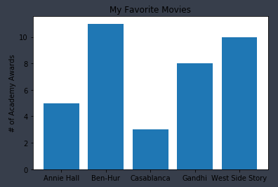
- 히스토그램이란 정해진 구간에 해당되는 항목의 갯수를 보여줌으로써 값의 분포를 관찰할 수 있는 그래프의 형태
ex)
from matplotlib import pyplot as plt
from collections import Counter
grades = [83, 95, 91, 87, 70, 0, 85, 82, 100, 67, 73, 77, 0]
decile = lambda grade:grade // 10*10
histogram = Counter(decile(grade) for grade in grades)
plt.bar([x for x in histogram.keys()], #각 막대를 옮기려면 x옆에 숫자를 붙인다
       histogram.values(),             #각 막대의 높이를 정해준다(grades)
       8)                              #높이는 8로 한다
plt.axis([-5, 105, 0, 5])              #x축은 -5부터 105, y축은 0부터 5
plt.xticks([10*i for i in range(11)])  #x축의 레이블은 0, 10, 20, ..., 100
plt.xlabel("Decile")
plt.ylabel("# of Students")
plt.title("Distribution of Exam 1 Grades")
plt.show()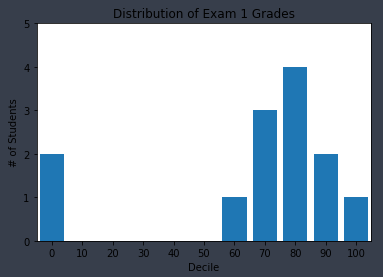
1) plt.bar의 세번째 인자는 막대의 너비를 정한다. 여기서는 각 구간의 너비가 10이므로, 8로 정해서 막대 간에 공간이 생기게 했다.
2) 만약 막대들의 중점이 맞지 않는다면, -(왼쪽), +(오른쪽)으로 이동해서 중점으로 만들어준다.
3) plt.axis는 x축의 범위를 -5에서 105로 한다. 0, 100에 해당하는 막대가 잘리지 않도록 그리기 위해서이다. 또한 y축의 범위를 0부터 5로 정한다.
4) plt.xticks는 x축의 레이블이 0, 10, 20, ..., 100이 되게 했다.
- plt.axis를 사용할 때는 신중해야 하는데, y축이 0에서 시작하지 않으면 오해를 불러일으키기 쉽기 때문이다.
from matplotlib import pyplot as plt
mentions = [500, 505]
years = [2013, 2014]
plt.bar([2013, 2014], mentions, 0.8)
plt.xticks(years)
plt.ylabel("# of times I ehard someone say 'data science'")

#이렇게 하지 않으면 matplotlib이 x축에 0,1레이블을 달고 주변부에 +2.013e3라고 표기할 것이다
plt.ticklabel_format(useOffset=False)

#오해를 불러일으키는 y축은 500 이상의 부분만 보여줄 것이다
plt.axis([2012.5, 2014.5, 499, 506])
plt.title("Look at the 'Huge' Increase!")
plt.show()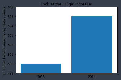
- 아래의 그래프는 위의 그래프보다 더 적합한 축을 사용했고, 더 합리적인 그래프가 되었다.
from matplotlib import pyplot as plt
mentions = [500, 505]
years = [2013, 2014]
plt.bar([2013, 2014], mentions, 0.8)
plt.xticks(years)
plt.ylabel("# of times I ehard someone say 'data science'")
plt.ticklabel_format(useOffset=False)
plt.axis([2012.5, 2014.5, 490, 550])
plt.title("Not So Huge Anymore")
plt.show()
선 그래프
- plt.plot()을 이용하면 선 그래프를 그릴 수 있다.
- 어떤 경향을 보여줄 때 유용하다.
from matplotlib import pyplot as plt
variance = [1,2,4,8,16,32,64,128,256]
bias_squared = [256,128,64,32,16,8,4,2,1]
total_error = [x+y for x, y in zip(variance, bias_squared)]
xs = [i for i, _ in enumerate(variance)]

#한 차트에 여러 개의 시리즈를 그리기 위해 plt.plot을 여러번 호출할 수 있다.
plt.plot(xs, variance, 'g-', label='variance')       #초록색 실선
plt.plot(xs, bias_squared, 'r-', label='bias^2')     #붉은색 점선
plt.plot(xs, total_error, 'b:', label='total error') #파란색 점선

#각 시리즈에 label을 미리 달아놨기 때문에 범례(legend)를 그릴 수 있다.
#loc=9는 위쪽 중앙을 의미한다
plt.legend(loc=9)
plt.xlabel("model complexity")
plt.title("The Bias-Variance Tradeoff")
plt.show()
산점도
- 두 변수 간의 연관관계를 보여주고 싶을 때 적합하다.
from matplotlib import pyplot as plt
friends = [70,65,72,63,71,64,60,64,67]
minutes = [175,170,205,120,220,130,105,145,190]
labels = ['a','b','c','d','e','f','g','h','i']
plt.scatter(friends, minutes)

#각 포인트에 레이블을 단다
for label,friend_count,minute_count in zip(labels,friends,minutes):
    plt.annotate(label,
                xy=(friend_count,minute_count), #label을 데이터 포인트 근처에 둔다
                xytext=(5,-5),                  #약건 떨어져 있게 한다
                textcoords='offset points')
plt.title("Daily Minutes vs. Number of Friends")
plt.xlabel("# of friends")
plt.ylabel("daily minutes spent on the site")
plt.show()
※ 위 그래프는 각 사용자의 친구 수와 그들이 매일 사이트에서 체류하는 시간 사이의 연관성을 보여준다.
- 변수들끼리 비교할 때 matplotlib이 자동으로 축의 범위를 설정하게 하면 아래의 그래프같이 공정한 비교를 하지 못할 수 있다.
from matplotlib import pyplot as plt
test_1_grades = [99,90,85,97,80]
test_2_grades = [100,85,60,90,70]
plt.scatter(test_1_grades,test_2_grades)
plt.title("Axes Aren't Comparable")
plt.xlabel("test 1 grade")
plt.ylabel("test 2 grade")
plt.show()
- plt.axis("equal") 명령을 추가하면 아래의 그래프처럼 공정한 비교를 할 수 있게 된다.
from matplotlib import pyplot as plt
test_1_grades = [99,90,85,97,80]
test_2_grades = [100,85,60,90,70]
plt.scatter(test_1_grades,test_2_grades)
plt.axis("equal")
plt.title("Axes Aren't Comparable")
plt.xlabel("test 1 grade")
plt.ylabel("test 2 grade")
plt.show()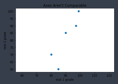
※ 위 그래프를 보면 test2에서 대부분의 편차가 발생했다는 사실을 알 수 있다.
test1의 범위(80~97.5), test2의 범위(60~100)